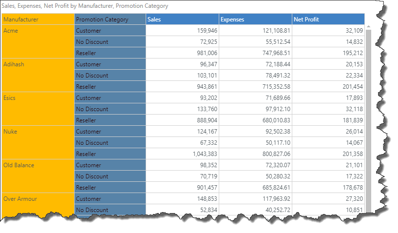
Column Sizing
Column width can be easily changed by applying a preset, or by customization. The options available for column sizing are designed to meet a variety or formatting needs, including text wrapping for column and row headers. These tools give you flexibility and control over the look of your grid and ensure legibility.
Changing Column Widths
Column widths may be increased or decreased by hovering over column header border until the cursor appears as a double arrow. Drag the cursor to the left to shrink the column, or to the right to enlarge it.

Column Sizing Options
The columns sizing drop-down menu features 5 presets. These presets determine the width of the grid's columns, and whether or not the column or row width can be customized. Open the Column Sizing drop-down from the Component ribbon.

From the drop-down, select the required preset. Alternatively, select Custom to customize columns widths, or click More to open the Grid Size Settings dialog (see below).

Shrinks the grid's columns to the minimum width possible for the text it contains. Any previous or subsequent customization made to columns will be overridden, while retaining the ability to customize the width of the row headers column.
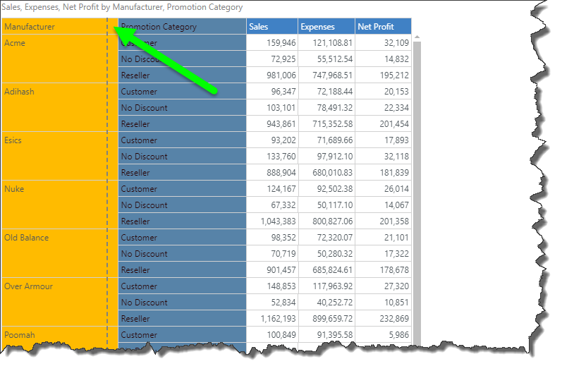
Shrinks the grid's row columns to the minimum width possible for the text it contains, while retaining the ability to customize the column widths. Any previous or subsequent customization made to row columns will be overridden, unless those changes were made using the double arrow tool (see section below, Combined Row Width).
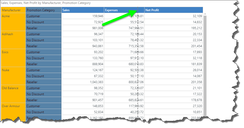
Shrinks all columns, including row columns, to the minimum width possible for the text it contains. Any previous or subsequent customization made to columns will be overridden.

Expand or shrink columns to fit the canvas, while retaining the ability to customize row column width. Changes make to the column width will be ignored.

Expand or shrink columns, including row columns, to fit the canvas.
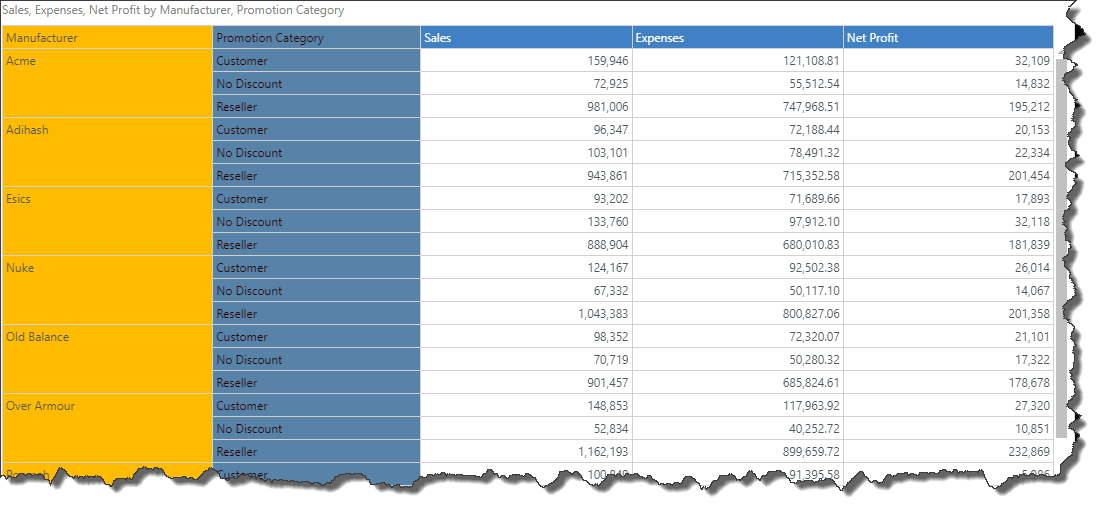
Customize the width of any columns in the grid. Any custom changes are saved after selecting a different column sizing mode, so that if you switch back to custom, your previous custom selections will be displayed.

Combined Row Width
You can also customize the combined row width. This is useful if you have a large grid containing several row columns, and you want to ensure that each row column is visible.
To customize the combined row width, hover over the border between the right-most row and the left-most column. A double-headed arrow will appear (blue arrow below); drag the arrow to increase or decrease the total row width. Depending on your grid row settings (continue reading to learn more), a scroll bar may be added to the bottom of the grid (green arrow below).

Grid Size Settings Dialog
To open the Grid Size Settings dialog, click More from the Column Sizing drop-down. From the Grid Size Settings dialog you can customize the size of the total combined width of the row header columns for matrix grids.
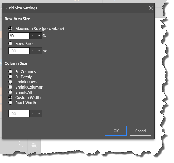
Row Area Size
From Row Size Area you can customize the size of the total combined width of the row header columns for matrix grids.
Maximum Size (percentage): define the maximum total combined row width, relative to the size of the canvas. For example, if Relative is set to 80%, then the rows cannot take up more than 80% of the canvas. If the given maximum is surpassed, then a scroll bar is added to the bottom of the grid (blue arrow below), enabling users to scroll across to view all the rows.
Fixed Size: set the maximum total combined row width by pixel; if Fixed is set to 100 pixels, then the combined row width cannot be greater than 100 pixels. If this maximum is surpassed, a scroll bar is added to the bottom of the grid.

Column Size
This section displays the same options available from the main Column Sizing drop-down (described above), with the addition of the Exact Width option. Exact Width allows you to set a given number of pixels as the column width for all columns in the grid.
The value in the Exact Width field is set to 100 by default. In the image below, it was increased to 150.
